-
When people
are heard,
teams are happyOur accessible employee engagement surveys help teams be heard wherever they work. Giving you frequent insights to create change that matters.
Let's chat
-
Get into your

Our employee engagement surveys give you the tools to create a workplace where great people thrive. Making every Monday feel like Friday.
Speak to the Stribe team
-
just works, so you can too
With Stribe’s suite of clever tricks, such as sentiment analysis and key phrase extraction, you’ll save time and have the confidence to make positive changes that create a happier, safer workplace!
Find out more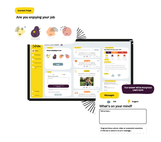
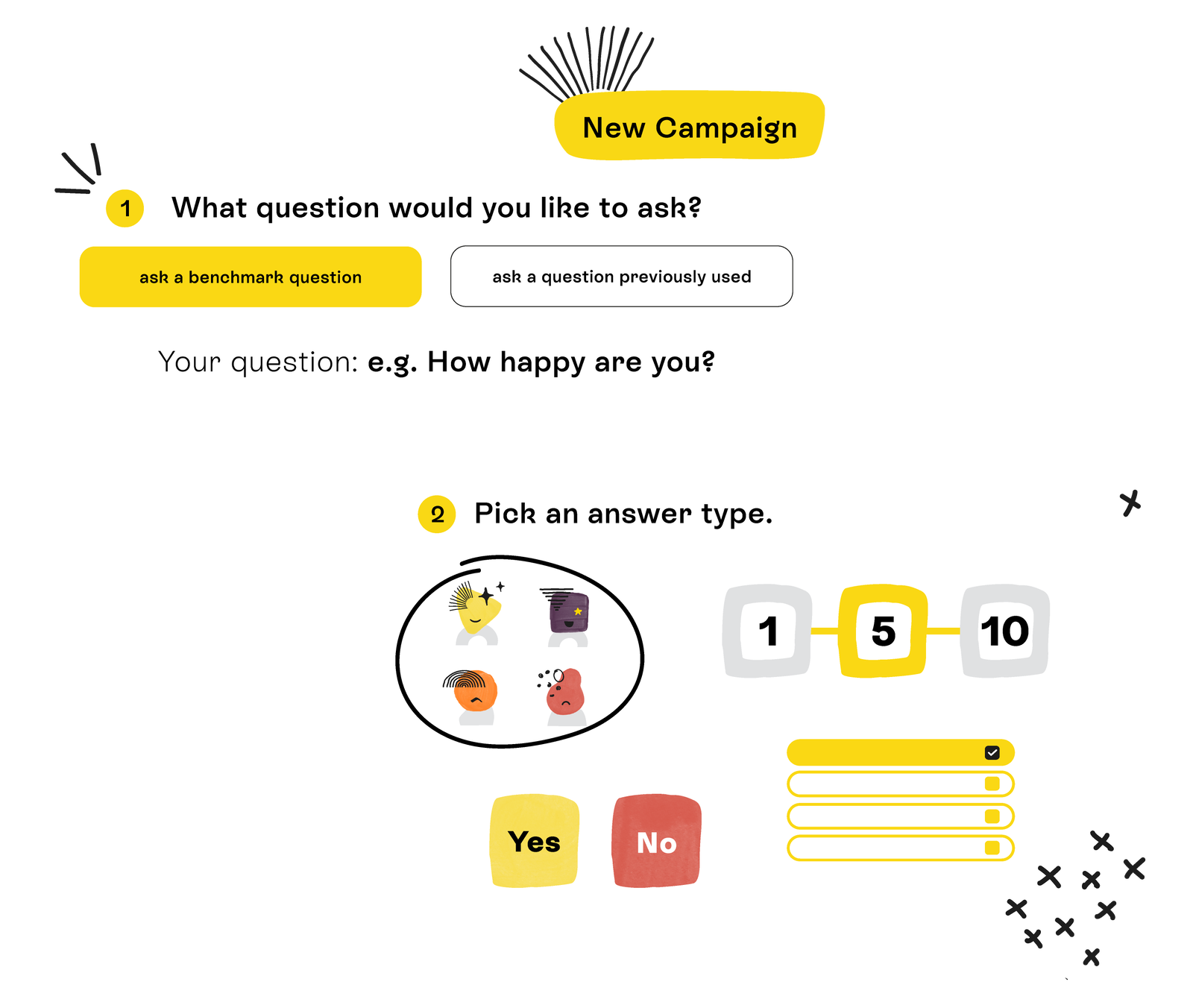
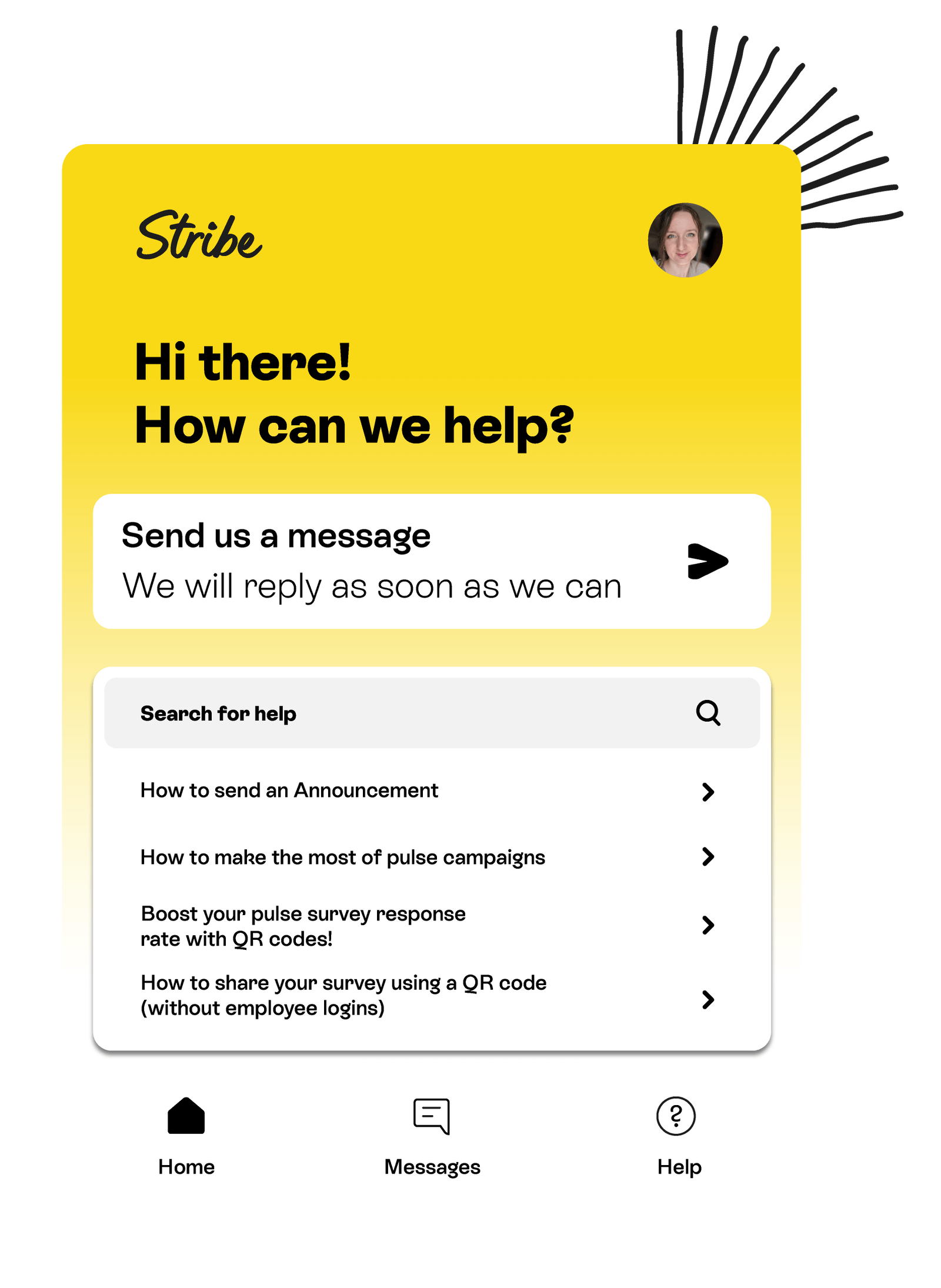
What exactly is Stribe?

As seen on


Level-up your team's happiness and
productivity with Stribe
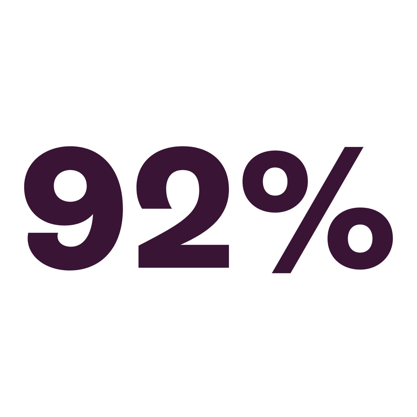
All-time high satisfaction
Stribe’s suite of clever tools and tricks help you understand what matters most to your people – so you can cultivate a culture they deserve.
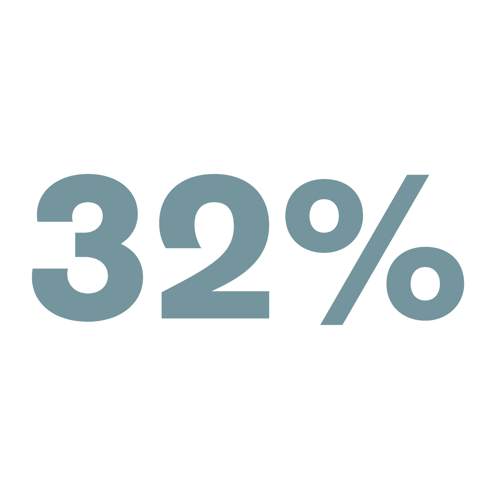
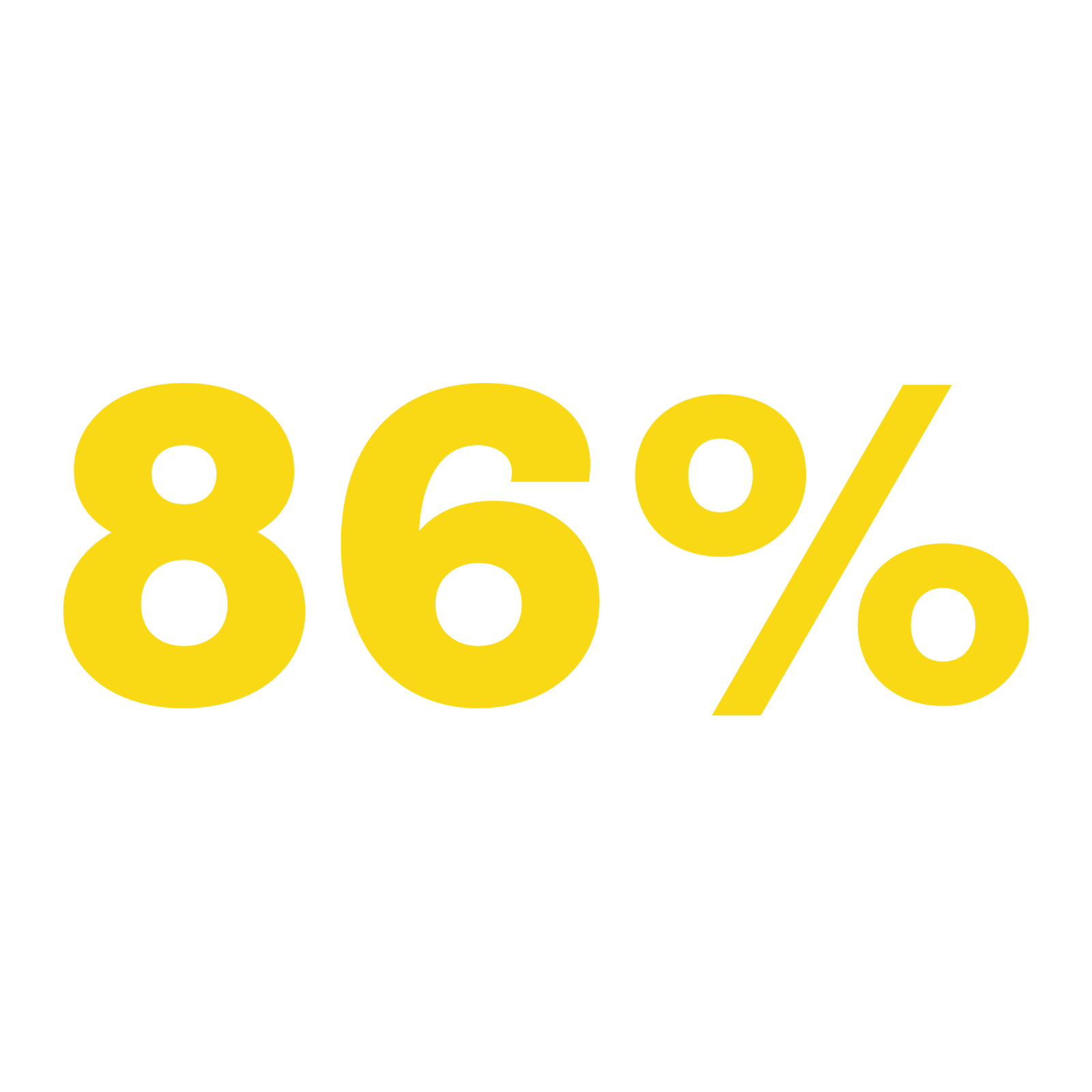
Increase in survey response rates
With multiple communication and survey channels, you’re able to reach your people wherever they work – giving you higher response rates than other platforms.
Reduction in stress leave
Understand how your workforce is truly feeling with anonymous messaging and pulse surveys. Your insights will lead change that matters.
 I remember my colleague saying that there was no other way we would’ve been able to capture that information without using Stribe - it does it all for you.
Bolton Council Communications and Engagement Manager
Customer success stories


Pulse Survey Software FAQs
Is Stribe anonymous?
Yes, Stribe is anonymous! And we’re very committed to this too.
We know it’s the only way employees feel 100% comfortable sharing their feedback. With Stribe the power of anonymity is always with the employee. They decide whether they want to share their name or not.
The only area of the tool that isn’t anonymous is Shout-outs, but even then, you can make a Shout-out private if you would prefer.
How do I choose pulse survey software?
Selecting the right employee engagement platform requires careful consideration.
Begin by defining your organisation’s unique needs and goals. Look for a platform that aligns with these objectives and offers customisable features. Consider user-friendliness, scalability, integration capabilities and seek recommendations.
How much does Stribe's survey software cost?
The cost of employee engagement software varies based on several factors, such as the number of users, the features included, and the provider’s pricing model. Some platforms offer tiered pricing or charge per user, while others have a subscription-based model.
How do I engage employees who don't work at computers?
Stribe is accessible across all platforms, including our Android and iOS apps.
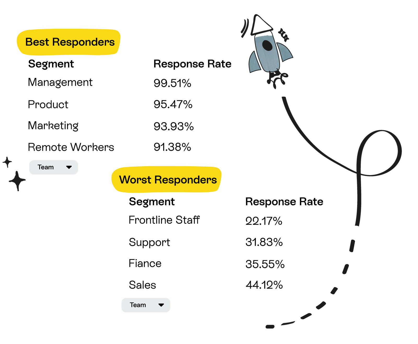
You can also share your pulse surveys ‘offline’ to employees who don’t have email addresses using links or QR codes. This means you still gather answers and – most importantly – segment data from colleagues who are dispersed and deskless.


Hear what our happy customers are saying!

“We realised that it’s easy to say ‘everyone can speak to their line manager’ or ‘send an email if you want to talk’. For us Stribe is, for the first time, something that is accessible to everyone. It allows for that open communication which we’ve never had before.”
Sam Shek, Operations Director, Ruia Group

“Many of our colleagues are not desk-based and therefore require Stribe’s unique balance of engagement tactics to complete their surveys. Stribe’s team supported us end-to-end from design, development and delivery to ensure high response rates and quality insights.”
Louise Brown, Vice Principal, Wigan and Leigh College
How will Stribe’s pulse survey software help me?
Our flexible software makes it simple for you to engage your employees. Especially those who are the hardest to reach. Stribe allows you to gather instant and frequent insights to help you better understand your team.
We make sure our software does the heavy lifting for you by making your data easy to digest so that you can focus on action planning and creating real change instead (yay!). Our People Science team are always on hand too. They work with you to create, plan and launch successful surveys – and maximise the rest of Stribe’s features.
Will using Stribe achieve a good response rate?
Stribe is packed with features to make it easy for everyone in your team to respond, even the folk that don’t have daily access to emails.
On top of that, our team of People Scientists will work with you every step of the way to make sure your survey launch is a total success. We’ll help you with everything from crafting pre-survey communications to creating effective ‘You Said, We Did’ campaigns.
On average, our customers achieve response rates of 74-81% (depending on the size of the organisation) – that’s twice as high as the UK and US average of 30-40%!
What size organisation does Stribe work with?
We’re here to help teams of all sizes, from small startups of just a few staff to large organisations with over 10,000 employees! Our software is super adaptable, which means it’ll fit the needs of your organisation, no matter how big or small.
We’re constantly improving our software to ensure that it stays up-to-date and effective for every team. No matter how much your organisation grows or changes. With clever pulse survey features like benchmarking, word tiles, sentiment analysis, key phrase extraction, ‘You said, We did’, and automated historical graphs, you will never skip a beat when it comes to your employee strategy.
Brilliant things happen when we talk
Interested to see how Stribe works? We'd love to show you.
Let's chat